With the combination of the main task, being the music video and other media products such as the digipak and the advert for my music album. Most artists these days try to publicize there music via either adverts and social networking, therefore I want to replicate this as much as possible so I have a professional looking media product.
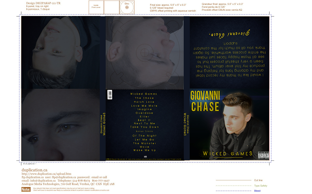
When producing my digipak for my media project I had to use a range of software to do so, the main piece of software that I used to create my digipak was Adobe Photoshop CS4/CS5. The inspiration for my digipak was Jason Deurlos music album, as the genre of music for my music video is more mainstream we needed to make sure that the artist was placed all over the album, as the artist is the one selling the music. But at first I made a digipak which didn't have the artist on it, and so after much deliberation I decided to go with the digipak design I have now. It was extremely crucial that I stuck to a similar house style theme with my digipak and my advert for my artist, in this case I kept to a black and yellow house style theme for my advert and digipak. So as you can see both the digipak and the advert both incorporate the same house style which is yellow and black, Also the advert and the digipak front cover have the same image, this is so people know what to look for if they decide to buy the album. The advert has a large image of the artist on it, this is because the artist is selling the album and only the artist can differentiate themselves from the competition, this is why the artist needs to be prominent on the digipak.
.png)
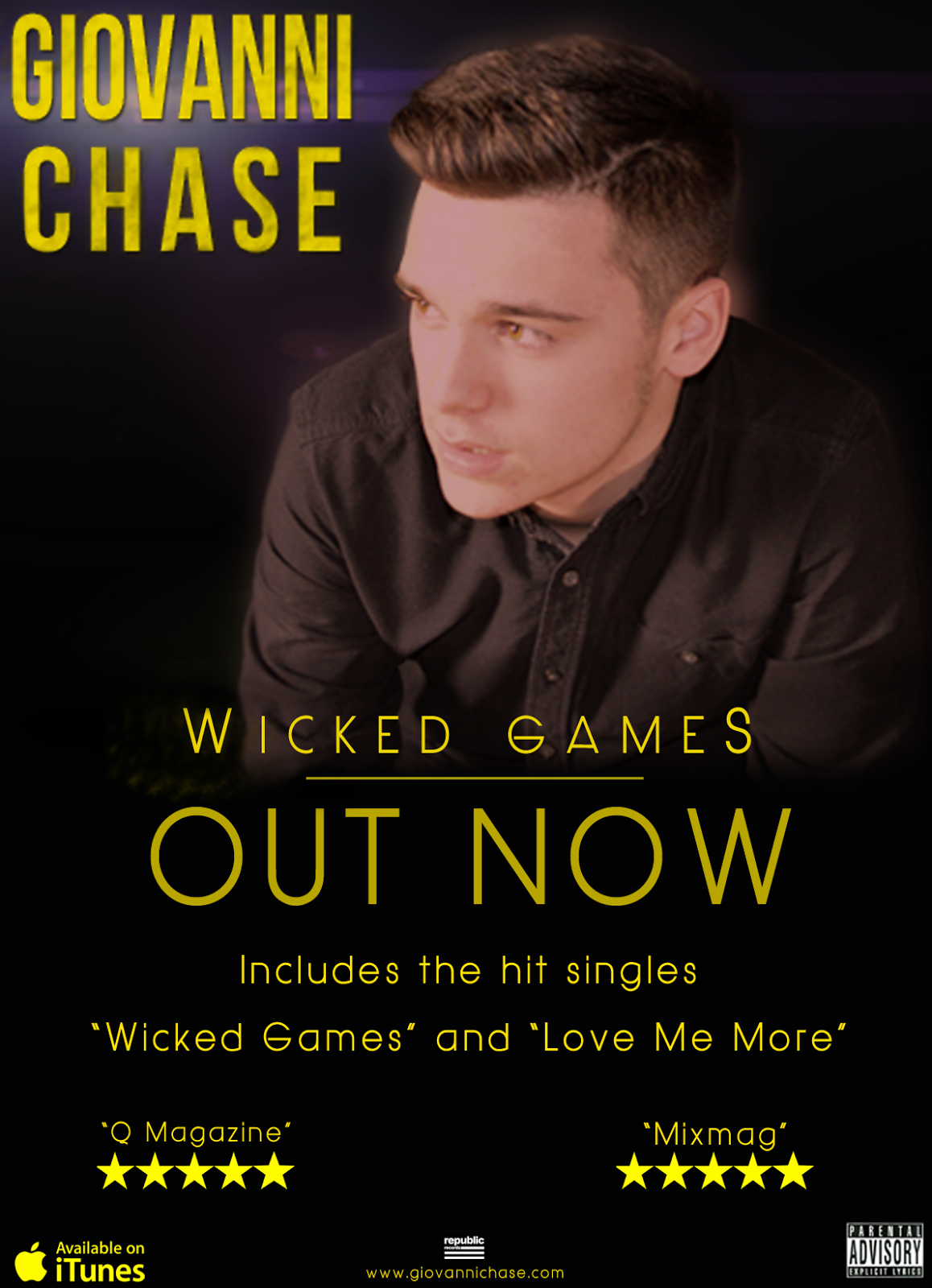.png&container=blogger&gadget=a&rewriteMime=image%2F*) On the left of the screen we have my advert for my artist. As my artist is selling the album, I have made the artist prominent on the front cover and have made him stand out with a black background. My music video has many prolonged shots of the artist and are framed the same as my advert, and so you know there is a relation between the advert and the music video that I have created. I have also used the same image from my digipak front cover, this is so people will know that there is a relation between the digipak and the advert.
On the left of the screen we have my advert for my artist. As my artist is selling the album, I have made the artist prominent on the front cover and have made him stand out with a black background. My music video has many prolonged shots of the artist and are framed the same as my advert, and so you know there is a relation between the advert and the music video that I have created. I have also used the same image from my digipak front cover, this is so people will know that there is a relation between the digipak and the advert. I have used two different types of fonts, one type of font for the artists name and then another font for the rest of the other text. I have chosen a very bold font for my artists name as it then draws attention to the artists name, and as my artist is selling the music he needs to be prominent throughout my tasks.
When deciding what shot would look best for the front panel of the digipak and the magazine advert, I chose the one which reveals the least about the artist but still be able to show the audience who he is, this is why i chose the one here, you can see him, but he is not looking directly at you and so causes some mystery around the artist which is what I wanted to happen, it will get the audience thinking about the artist before they even watch the music video.
The genre of the digipak and the magazine advert was the genre of the song we chose, which was R&B. Most R&B albums have the artist on the front of there digipaks and there adverts, and this is what I have tried to in my ancillary tasks.
The target audience I was looking to attract with this type of media consumption are people aged 16 and 25 mainly female and male. This is primarily due to the fact that the music video is very sexualised and has a lot of drug consumption, and this would not be appreciated by peoples parents who have children under the age of 16. The reason why it's aimed at these young people is because drugs and alcohol are being used at a young these days and so I wanted to aim it at this audience as a way to deter them. In the video the woman dies due to a overdose/depression and so this may make young people think before they take drugs, drink and smoke at such a young age. This is why I had to put Parental Advisory on my magazine and digipak to warn viewers.

The above digipak is Jessie J's album cover and back cover, As you can see there is a on going theme through out the digipak, with black and white, even Jessie J has got her make up and hair to match the theme of the digipak. This goes the same for my digipak as my digipak has kept to the same theme through out as well, mine being yellow for the text and dark blue for the background of each panel, also the artist on my digipak has got a slightly yellow tint to him, and so the image of my artist is more prominent with a dark blue background.
When I was researching digipaks, I noticed that most of the digipaks has a different font for the artists name, and this occurs in Jessie J's digipak front panel as we can see it is bigger than the actual album name and is gold. I tried to imitate this in my digipak by having the artists name larger than the album name, and to make it a different font so people will be attracted to by the name of the artists not so much the album name.
For the the spine of Jessi J's digipak she has the name of the album and her name on the spine in very small writing, which in my opinion should of been larger as she is selling her music and you want to make sure that people can read it with ease, which you can't really do with her album, mine on the other hand is easier to read as the writing is central on the spine and is larger in font, this is so people can read it from a distance rather than having to come up close to read the album name.
On the back panel of Jessie J's digipak we have the bare code and record label, as it's an official album they need to include that within there digipak, and I wanted my digipak to look as professional as possible so I incldued all of that on the back panel of my digipak.

No comments:
Post a Comment