4. How did you use media technologies in the
construction and research, planning and evaluation stages?
George's Music Video Blog G324
George Schena 8218
Monday, 27 January 2014
Evaluation Question 3
3. What have you learned from your audience
feedback?
The first stage of the project was thinking up the idea on what to base our music video around. Me and my partner both thought of having a woman who needs money badly and is willing to do anything to get her hands on some cash. So we thought of having a the artist pay to have sex with her. The start of the story is the artist appears at the house, gives the woman a kiss and they start to have "sex" and do drugs and alcohol with the woman actress. They have intimate scenes which are seen in the music video, by the end of the music video the female actress overdoses on pills and the actress realises after the man leaves that she has had enough of putting her body up for sale, and as she can't cope with what she has had to do she decided to end her life in the bath, as the artist leaves the house after paying her.
Feedback for my initial ideas for my music video:
Lisha: "I like the concept of the music video, I think that it has potential and can look really good with some creative camera work".
Nikita: " You will need to make sure that the lip syncing is good as it will add to the realism of the music video".
Ms O'shea: "Within your music video you will need to make sure you have some costumes for the music video, as it really helps with the overall mise-en-scene of the music video".
Kelly: "You will need to focus on what age you are aiming at as you will need to do research into what that age group will like to see within a music video".
Jake: "You will need to go scout some locations for this music video as you have a good concept but you need to make sure that the locations fit your genre".
Leon: "The colour correction works really well in keeping a constant look throughout your video. The themes you've used not only illustrate the song lyrics but they also help sell your artist. Overall good job!
The overall aspect I got from the feedback given for my initial ideas was that I need to take time and think about the locations and costumes being used in my music video, as they will add to the mise-en-scene of the music video. Another key aspect that my artist must get right is to have flawless lip syncing as I will loose marks for poor lip syncing.
I then therefore put more time and effort into these aspects so we found the location which was my friends house, and was perfect for the scene as it looked like a show house and gave the video a professional look. We changed where we were going to film as a result of this, a change which worked out for the better in my opinion.
Feedback for my Rough Cut by my peers and teachers:
Music video feedback after watching my rough cut for the very first time.
After receiving my feedback from my rough cut, I had to clean up some minor errors that my peers and teachers pointed out, I got rid of the red tint to one of my shots as it didn't fit with my music video as no other shots had a red tint and so it looked out of place within my music video, I also got rid of the text that was on the shot for the same reason as the red tint effect. I used other footage to replace the irrelevant shots that where there before of the cigarettes and the ash tray, and used either the base layer of the artist singing or used shots when the artist and the female actress are being intimate together. I edited certain shots so they were more zoomed in so you could see the intense scenes that the artist was having with the female actress. I refined the lip syncing with the audio track of the song by aligning the audio and video track so that the lip syncing was in time with the music, which was a fairly simple task to do. For my final version I used colour grading on the entire music video, so that it was different from other music videos that were created. We made sure the costumes would fit the genre, especially for the female actress as she wore fish net tights, high heels and a revealing top which added to the realism of the narrative within the music video, the male artist wore a black shirt and jeans as he is dressed more casual.
Class Feedback on my Digipak and Magazine Advert:
Here are my digipak designs I created
As you can see above I started to make my digipak and then after feedback from my peers and teachers I decided to change it completely, a decision I now think was the best option for my artist. After talking with my teacher she said that "most R&B music videos have the artist all over there digipaks and magazine adverts", which after much research was true, and so I decided to change the design and start fro scratch once again. Most of my peers also mentioned that they didn't really like the overall look of the previous digipak design and after asking more people they agreed with my peers and that reinforced my decision to change the design.
Lisha: This is so good George!! You have a variety of shots and this definitely works well with your genre. I would say that you should reduce the colour correction, only because it takes away from the RGB split you have and I prefer that to the color correction. But this is still amazing. :).
Kelly: I love the way the footage appears on the beat. Your lip sync is also really good, you surprised me! You also have such a variety of shots that really bring the narrative together.
Alisha: You have done a great job portraying the story line across. The lip sync is on point with the video which provides to be really effective. The variety of shots used is amazing, as you incorporate all different angles helping bringing the narrative of the video together. Overall, I think it’s a brilliant video put together in keeping with the genre.
Luke: I really like the colour grading that was used it really gives it a distinct look to your music video and I think it looks good!
Nicole: okay, I think the video is really good! I like the colour correction, the lip syncing looks perfect and you've used a variety of different camera shots. I dunno what it's called but if you watch at 1:42, I love the way you've edited it. I don't know all of the technical terminology haha. It's a great music video!
Overall Opinions of My Music Video (Final Version)
People that i showed the music video too all said that they really liked the visuals, so the cmaera work and the realism of the artist and the actress, which was a few of the key aspects which i wanted to focus on as it would really aid me in my final music video. Some people understood the storyline after watching the music video, some people had to be explained the storyline, and this is kind of what i wanted to happen, I like that it has some mystery behind the music video, It kept the audience guessing what it was exactly about and that was a good way for them to stay engaged with the video.
The first stage of the project was thinking up the idea on what to base our music video around. Me and my partner both thought of having a woman who needs money badly and is willing to do anything to get her hands on some cash. So we thought of having a the artist pay to have sex with her. The start of the story is the artist appears at the house, gives the woman a kiss and they start to have "sex" and do drugs and alcohol with the woman actress. They have intimate scenes which are seen in the music video, by the end of the music video the female actress overdoses on pills and the actress realises after the man leaves that she has had enough of putting her body up for sale, and as she can't cope with what she has had to do she decided to end her life in the bath, as the artist leaves the house after paying her.
Feedback for my initial ideas for my music video:
Lisha: "I like the concept of the music video, I think that it has potential and can look really good with some creative camera work".
Nikita: " You will need to make sure that the lip syncing is good as it will add to the realism of the music video".
Ms O'shea: "Within your music video you will need to make sure you have some costumes for the music video, as it really helps with the overall mise-en-scene of the music video".
Kelly: "You will need to focus on what age you are aiming at as you will need to do research into what that age group will like to see within a music video".
Jake: "You will need to go scout some locations for this music video as you have a good concept but you need to make sure that the locations fit your genre".
Leon: "The colour correction works really well in keeping a constant look throughout your video. The themes you've used not only illustrate the song lyrics but they also help sell your artist. Overall good job!
The overall aspect I got from the feedback given for my initial ideas was that I need to take time and think about the locations and costumes being used in my music video, as they will add to the mise-en-scene of the music video. Another key aspect that my artist must get right is to have flawless lip syncing as I will loose marks for poor lip syncing.
I then therefore put more time and effort into these aspects so we found the location which was my friends house, and was perfect for the scene as it looked like a show house and gave the video a professional look. We changed where we were going to film as a result of this, a change which worked out for the better in my opinion.
Feedback for my Rough Cut by my peers and teachers:
Music video feedback after watching my rough cut for the very first time.
After receiving my feedback from my rough cut, I had to clean up some minor errors that my peers and teachers pointed out, I got rid of the red tint to one of my shots as it didn't fit with my music video as no other shots had a red tint and so it looked out of place within my music video, I also got rid of the text that was on the shot for the same reason as the red tint effect. I used other footage to replace the irrelevant shots that where there before of the cigarettes and the ash tray, and used either the base layer of the artist singing or used shots when the artist and the female actress are being intimate together. I edited certain shots so they were more zoomed in so you could see the intense scenes that the artist was having with the female actress. I refined the lip syncing with the audio track of the song by aligning the audio and video track so that the lip syncing was in time with the music, which was a fairly simple task to do. For my final version I used colour grading on the entire music video, so that it was different from other music videos that were created. We made sure the costumes would fit the genre, especially for the female actress as she wore fish net tights, high heels and a revealing top which added to the realism of the narrative within the music video, the male artist wore a black shirt and jeans as he is dressed more casual.
Class Feedback on my Digipak and Magazine Advert:
Here are my digipak designs I created
As you can see above I started to make my digipak and then after feedback from my peers and teachers I decided to change it completely, a decision I now think was the best option for my artist. After talking with my teacher she said that "most R&B music videos have the artist all over there digipaks and magazine adverts", which after much research was true, and so I decided to change the design and start fro scratch once again. Most of my peers also mentioned that they didn't really like the overall look of the previous digipak design and after asking more people they agreed with my peers and that reinforced my decision to change the design.
Final Version of Everything- Class feedback and teacher feedback
Lisha: This is so good George!! You have a variety of shots and this definitely works well with your genre. I would say that you should reduce the colour correction, only because it takes away from the RGB split you have and I prefer that to the color correction. But this is still amazing. :).
Kelly: I love the way the footage appears on the beat. Your lip sync is also really good, you surprised me! You also have such a variety of shots that really bring the narrative together.
Alisha: You have done a great job portraying the story line across. The lip sync is on point with the video which provides to be really effective. The variety of shots used is amazing, as you incorporate all different angles helping bringing the narrative of the video together. Overall, I think it’s a brilliant video put together in keeping with the genre.
Luke: I really like the colour grading that was used it really gives it a distinct look to your music video and I think it looks good!
Nicole: okay, I think the video is really good! I like the colour correction, the lip syncing looks perfect and you've used a variety of different camera shots. I dunno what it's called but if you watch at 1:42, I love the way you've edited it. I don't know all of the technical terminology haha. It's a great music video!
Overall Opinions of My Music Video (Final Version)
People that i showed the music video too all said that they really liked the visuals, so the cmaera work and the realism of the artist and the actress, which was a few of the key aspects which i wanted to focus on as it would really aid me in my final music video. Some people understood the storyline after watching the music video, some people had to be explained the storyline, and this is kind of what i wanted to happen, I like that it has some mystery behind the music video, It kept the audience guessing what it was exactly about and that was a good way for them to stay engaged with the video.
Sunday, 26 January 2014
Evaluation Question 2
2. How effective is the combination of your
main product and ancillary texts?
With the combination of the main task, being the music video and other media products such as the digipak and the advert for my music album. Most artists these days try to publicize there music via either adverts and social networking, therefore I want to replicate this as much as possible so I have a professional looking media product.
When producing my digipak for my media project I had to use a range of software to do so, the main piece of software that I used to create my digipak was Adobe Photoshop CS4/CS5. The inspiration for my digipak was Jason Deurlos music album, as the genre of music for my music video is more mainstream we needed to make sure that the artist was placed all over the album, as the artist is the one selling the music. But at first I made a digipak which didn't have the artist on it, and so after much deliberation I decided to go with the digipak design I have now. It was extremely crucial that I stuck to a similar house style theme with my digipak and my advert for my artist, in this case I kept to a black and yellow house style theme for my advert and digipak. So as you can see both the digipak and the advert both incorporate the same house style which is yellow and black, Also the advert and the digipak front cover have the same image, this is so people know what to look for if they decide to buy the album. The advert has a large image of the artist on it, this is because the artist is selling the album and only the artist can differentiate themselves from the competition, this is why the artist needs to be prominent on the digipak.
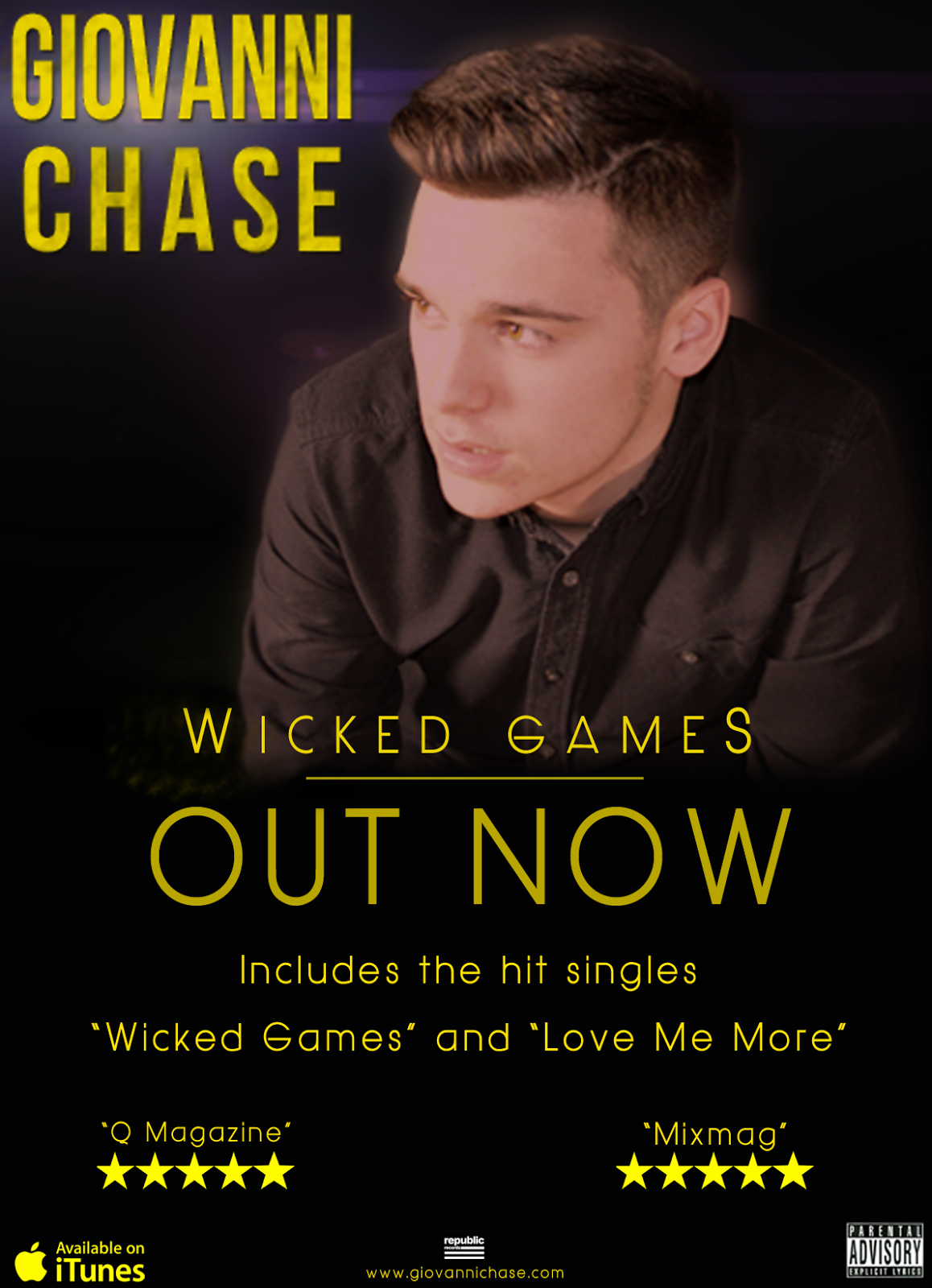.png) On the left of the screen we have my advert for my artist. As my artist is selling the album, I have made the artist prominent on the front cover and have made him stand out with a black background. My music video has many prolonged shots of the artist and are framed the same as my advert, and so you know there is a relation between the advert and the music video that I have created. I have also used the same image from my digipak front cover, this is so people will know that there is a relation between the digipak and the advert.
On the left of the screen we have my advert for my artist. As my artist is selling the album, I have made the artist prominent on the front cover and have made him stand out with a black background. My music video has many prolonged shots of the artist and are framed the same as my advert, and so you know there is a relation between the advert and the music video that I have created. I have also used the same image from my digipak front cover, this is so people will know that there is a relation between the digipak and the advert.
I have used two different types of fonts, one type of font for the artists name and then another font for the rest of the other text. I have chosen a very bold font for my artists name as it then draws attention to the artists name, and as my artist is selling the music he needs to be prominent throughout my tasks.
When deciding what shot would look best for the front panel of the digipak and the magazine advert, I chose the one which reveals the least about the artist but still be able to show the audience who he is, this is why i chose the one here, you can see him, but he is not looking directly at you and so causes some mystery around the artist which is what I wanted to happen, it will get the audience thinking about the artist before they even watch the music video.
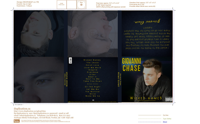
The genre of the digipak and the magazine advert was the genre of the song we chose, which was R&B. Most R&B albums have the artist on the front of there digipaks and there adverts, and this is what I have tried to in my ancillary tasks.
The target audience I was looking to attract with this type of media consumption are people aged 16 and 25 mainly female and male. This is primarily due to the fact that the music video is very sexualised and has a lot of drug consumption, and this would not be appreciated by peoples parents who have children under the age of 16. The reason why it's aimed at these young people is because drugs and alcohol are being used at a young these days and so I wanted to aim it at this audience as a way to deter them. In the video the woman dies due to a overdose/depression and so this may make young people think before they take drugs, drink and smoke at such a young age. This is why I had to put Parental Advisory on my magazine and digipak to warn viewers.
With the combination of the main task, being the music video and other media products such as the digipak and the advert for my music album. Most artists these days try to publicize there music via either adverts and social networking, therefore I want to replicate this as much as possible so I have a professional looking media product.
When producing my digipak for my media project I had to use a range of software to do so, the main piece of software that I used to create my digipak was Adobe Photoshop CS4/CS5. The inspiration for my digipak was Jason Deurlos music album, as the genre of music for my music video is more mainstream we needed to make sure that the artist was placed all over the album, as the artist is the one selling the music. But at first I made a digipak which didn't have the artist on it, and so after much deliberation I decided to go with the digipak design I have now. It was extremely crucial that I stuck to a similar house style theme with my digipak and my advert for my artist, in this case I kept to a black and yellow house style theme for my advert and digipak. So as you can see both the digipak and the advert both incorporate the same house style which is yellow and black, Also the advert and the digipak front cover have the same image, this is so people know what to look for if they decide to buy the album. The advert has a large image of the artist on it, this is because the artist is selling the album and only the artist can differentiate themselves from the competition, this is why the artist needs to be prominent on the digipak.
.png) On the left of the screen we have my advert for my artist. As my artist is selling the album, I have made the artist prominent on the front cover and have made him stand out with a black background. My music video has many prolonged shots of the artist and are framed the same as my advert, and so you know there is a relation between the advert and the music video that I have created. I have also used the same image from my digipak front cover, this is so people will know that there is a relation between the digipak and the advert.
On the left of the screen we have my advert for my artist. As my artist is selling the album, I have made the artist prominent on the front cover and have made him stand out with a black background. My music video has many prolonged shots of the artist and are framed the same as my advert, and so you know there is a relation between the advert and the music video that I have created. I have also used the same image from my digipak front cover, this is so people will know that there is a relation between the digipak and the advert. I have used two different types of fonts, one type of font for the artists name and then another font for the rest of the other text. I have chosen a very bold font for my artists name as it then draws attention to the artists name, and as my artist is selling the music he needs to be prominent throughout my tasks.
When deciding what shot would look best for the front panel of the digipak and the magazine advert, I chose the one which reveals the least about the artist but still be able to show the audience who he is, this is why i chose the one here, you can see him, but he is not looking directly at you and so causes some mystery around the artist which is what I wanted to happen, it will get the audience thinking about the artist before they even watch the music video.

The genre of the digipak and the magazine advert was the genre of the song we chose, which was R&B. Most R&B albums have the artist on the front of there digipaks and there adverts, and this is what I have tried to in my ancillary tasks.
The target audience I was looking to attract with this type of media consumption are people aged 16 and 25 mainly female and male. This is primarily due to the fact that the music video is very sexualised and has a lot of drug consumption, and this would not be appreciated by peoples parents who have children under the age of 16. The reason why it's aimed at these young people is because drugs and alcohol are being used at a young these days and so I wanted to aim it at this audience as a way to deter them. In the video the woman dies due to a overdose/depression and so this may make young people think before they take drugs, drink and smoke at such a young age. This is why I had to put Parental Advisory on my magazine and digipak to warn viewers.
The above digipak is Jessie J's album cover and back cover, As you can see there is a on going theme through out the digipak, with black and white, even Jessie J has got her make up and hair to match the theme of the digipak. This goes the same for my digipak as my digipak has kept to the same theme through out as well, mine being yellow for the text and dark blue for the background of each panel, also the artist on my digipak has got a slightly yellow tint to him, and so the image of my artist is more prominent with a dark blue background.
When I was researching digipaks, I noticed that most of the digipaks has a different font for the artists name, and this occurs in Jessie J's digipak front panel as we can see it is bigger than the actual album name and is gold. I tried to imitate this in my digipak by having the artists name larger than the album name, and to make it a different font so people will be attracted to by the name of the artists not so much the album name.
For the the spine of Jessi J's digipak she has the name of the album and her name on the spine in very small writing, which in my opinion should of been larger as she is selling her music and you want to make sure that people can read it with ease, which you can't really do with her album, mine on the other hand is easier to read as the writing is central on the spine and is larger in font, this is so people can read it from a distance rather than having to come up close to read the album name.
On the back panel of Jessie J's digipak we have the bare code and record label, as it's an official album they need to include that within there digipak, and I wanted my digipak to look as professional as possible so I incldued all of that on the back panel of my digipak.
Sunday, 5 January 2014
Evaluation Question 1
1. In what ways does your media product use,
develop or challenge forms and conventions of real media products?
My music video that I designed and directed from nothing all started from multiple inspirational music videos, and by combining all of these elements into one music video, I believe that I have created a very well put together music video.
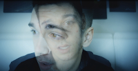
There are very basic common features that can be seen within all music videos that are produced. These may include numerous close ups of the artists, so that it shows that the artist is the main attraction for the music video. As you can see from my screenshot, I have followed a very basic convention of music videos, by implementing an extreme close up of the artist. And in the other image we have a close up of the artist hallucinating on drugs and this has been shot close up so you feel like your hallucinating with the artist.
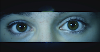
Most music videos have the artist singing throughout the music video whilst other things are happening in the music video. For my music video I did follow some aspects of this convention, as I did have the artist sing throughout the music video In some shots, but I also had the artist sing a backing track on a green screen and then edited it so it had a black background for my artist, so I would say I have developed this particular convention to make my music video more unique and fit the type of genre of my music video.
Another common music video convention that is used very regularly is the timing of the shot changes, most music videos will change shots along with the beat of the music, this is so the music video flows better and looks more effective.
Watch from 0:30 to 0:43 to see the changing shots to the beat of the song (example)
Watch from the start to 0:08 to see the changing shots to the beat of the song (My Music Video)
For my music video I implemented many different conventions into my music video. One main convention that was used is superimposition, this is where I layered two video files on each other and lowered the opacity of one video file so you can see both images, but the two video files would look faded, this is a good effect for my music video, as it fits with the drug overdose effect that my artist faces in the music video. So as you can see from my music video screenshot I have overlay-ed two video files over each other to cause this effect of an hallucination. This is a fairly common convention and I believe that its a very effective convention to use, in my music video genre, if it was in a more up beat music video It would look out of place with the slow fading of the video with the fast pace beats of the music.
There are two different types of music videos that I had to pick from, there are performance music videos and narrative music videos, I thought that as I did a thriller video last year I could include what I learnt from that and implement it into my music video this year. My music video has a clear story-line as I did not want to confuse the audience with a complex story-line for my music video. During the music video I included prolonged shots of the artist, and as it was a fairly slow song it fitted with the music video perfectly, the reason why I wanted to have prolonged shots of the artist was so that the audience had something to think about, and gave my artist a mysterious look about him, this would therefore engage my audience to watch the music video further.
1st Screenshot: In this screenshot we have a prolonged shot of the artist hallucinating with the drug overdose, this prolonged focus on the artist is a general music video convention, this therefore contributes to the construction of the star image. Furthermore I followed this particular convention as I thought It would be useful for connecting the artist with the audience.
2nd Screenshot: The second screenshot is more sexual as the actress is on top of the artist, which produces a very sexualised look for the audience. The aim of this music video was to place the audience in the position of the voyeur, because voyeurism is a typical convention of music videos and I wanted to develop this convention in my own.
3rd Screenshot: In the 3rd screenshot the artist is hallucinating, and therefore I try to use an effect known as superimposition, this is where you overlay video clips on top of each other. This is used in many music videos and is a typical convention of them. This convention is used throughout my music video as It helps with the with the drug overdose effect.
4th Screenshot: Throughout my music video, I implemented many prolonged shots of my artist, this is because my artist is the star of the music video and so I wanted this to be known throughout the music video, and therefore I created a start image for my artist due to the amount of prolonged shots of him. This again is another convention I have used for my music video and I have followed this particular convention throughout, also when doing this shot I had to use a green screen and then I edited the background so It would be black, I had to make sure the lighting was even, so that the light didn't make the green screen brighter on some parts, because then the colour would be uneven when editing.
5th Screenshot: This shot shows what type of genre my music video is, as the song we chose is a mainstream song and is R&B I researched what general conventions are implemented into these types of music videos, and one convention kept on appearing, and that was sexualisation and the female and male gaze. This shot shows the artist rubbing the woman's back in a sexual way while the camera slowly tilts down as it tracks the artists hands. In R&B music videos the woman is treated as an object of desire and this is what I have done here, and so therefore I followed this convention throughout my music video.
6th Screenshot: In this shot we have a close up of the artist about to kiss the actress, close ups as I mentioned before are another common convention in music videos and therefore I decided to implement them into my music video. I wanted to use close ups as they showed my artist which produces a star image for him, but not only that, by having close ups of my artist it makes the audience feel more amerced in the music video. Also by having the blue colour grading it makes the music video feel cold, and that's the effect I want to give off to my audience. So overall I followed this convention as well.
7th Screenshot: For the 7th shot we have the actresses in high heals walking round the pole in a very sexual way. The actresses high heels are vital in the story-line of the music video, as we see them multiple times throughout. The high heels are part of the mise-en-scene of the music video, as we see her working in them during the start of the video and then after the male leaves she then kills herself, but the camera tilts down next to the bath revealing her high heels and the drugs she was taking, and so there is a distinct link between the actress and her high heels. I have made the story-line fairly simple but In some music videos there is a deeper meaning and in my music video I have tried to not make it to obvious to the audience, yet still make the narrative understandable. So therefore this is a convention which I have developed to fit my music genre and what would look best for my music video.
8th Screenshot: In this shot we have drugs, dice and playing cards on the table, this shot shows a link between the lyrics of the song and the visuals, this is a common convention used in music videos. The lyrics are "bring the drugs baby I can bring the pain" and so therefore I have directly linked the visuals with the lyrics. So furthermore I have followed this convention fully for this shot.
9th Screenshot: The 9th shot shows the artist is sexually stroking the females leg, and its a close up of just her leg, this is known as fragmentation, this is where you take shots of a woman's body parts e.g legs, lips. You see this occur in many R&B music videos, which my video is, and so therefore I had to implement some form of fragmentation in my music video, and again this is another convention used, and so therefore I implemented this into my music video.
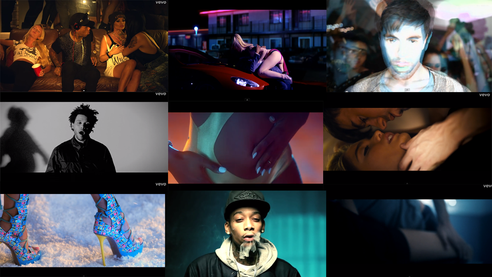
1st Screenshot: The first shot is the artist Kid Ink getting up from the sofa, and has girls all around him, this makes us concentrate on him even more because he is the only male in this shot. His record label want to portray him as a ladies man and a player and so that's why he is surrounded by women, also notice how Kid Ink is central in this shot, therefore showing that he is the star. This particular music video woman are treated like objects of desire and are just there in the background in nearly every shot, and so this follows the general convention of R&B music videos.
2nd Screenshot: The second shot is very sexualised as we have a shot of a woman on top of a man kissing each other, sexualised imagery is also another convention used within music videos and I have adopted this convention in my music video also.
3rd Screenshot: The 3rd shot has the artist hallucinating at a party, and as you can see superimposition has been used as there are multiple layers on this shot and gives off a very nice affect, this convention was also adopted from this music video and was used in mine as I thought it suited with the genre I decided to go with.
4th Screenshot: This shot was the inspiration for my music video as we have the main artist singing directly at the camera. This shot lasted 30 seconds and so was a prolonged shot of the artist which is a common music video convention, and again I used this in my music video also. The lighting used in this shot is has a noire look to it which looks really good on the artist, the lighting used creates a very depressed looking atmosphere which suits the song well.
5th Screenshot: This shot was taken from another R&B music video, and as you can see we a have fragmented shot of the woman's body, in this case her stomach. Because my music video has an R&B song I decided to implement some fragmented shots in my music video as well. This is a convention that is used in many professional music videos and I wanted a professional looking music video and so I used it in my music video.
6th Screenshot: This shot we have Enrique about to kiss the woman and this is part of the narrative of the music video. The music video is called "I Finally Found You" and so near the end of the music video he finds the woman of his dreams and they have a heated moment. This is a key concept developed by Carol Vernallis.
7th Screenshot: Here we have Niki Minaj in her brightly coloured high heels in her song "Super Bass" which is a very high tempo song at times, and does not really have a narrative concept like other music videos, and so the editing is very montage like, with clips of her body and of men and other objects to add to the mise-en-scene of the music video.
8th Screenshot: The 8th shot has the artist puff out some smoke, this gives off a cool affect when its done in slow motion, and adds to the smoke effect, the use of drugs and alcohol are used a lot in the urban genre, so most R&B videos once again use this convention.
9th Screenshot: The ninth shot we have a heated scene where we see a man stroking a woman's leg very erotically. This shot links directly with the lyrics of the song, when we see the shot of the man stroking the woman the lyrics are "make love to me babe" and so this shot is very literal to the lyrics of the song.
Goodwin Analysis
My music video that I designed and directed from nothing all started from multiple inspirational music videos, and by combining all of these elements into one music video, I believe that I have created a very well put together music video.
There are very basic common features that can be seen within all music videos that are produced. These may include numerous close ups of the artists, so that it shows that the artist is the main attraction for the music video. As you can see from my screenshot, I have followed a very basic convention of music videos, by implementing an extreme close up of the artist. And in the other image we have a close up of the artist hallucinating on drugs and this has been shot close up so you feel like your hallucinating with the artist.


Most music videos have the artist singing throughout the music video whilst other things are happening in the music video. For my music video I did follow some aspects of this convention, as I did have the artist sing throughout the music video In some shots, but I also had the artist sing a backing track on a green screen and then edited it so it had a black background for my artist, so I would say I have developed this particular convention to make my music video more unique and fit the type of genre of my music video.
Another common music video convention that is used very regularly is the timing of the shot changes, most music videos will change shots along with the beat of the music, this is so the music video flows better and looks more effective.
Watch from 0:30 to 0:43 to see the changing shots to the beat of the song (example)
Watch from the start to 0:08 to see the changing shots to the beat of the song (My Music Video)
For my music video I implemented many different conventions into my music video. One main convention that was used is superimposition, this is where I layered two video files on each other and lowered the opacity of one video file so you can see both images, but the two video files would look faded, this is a good effect for my music video, as it fits with the drug overdose effect that my artist faces in the music video. So as you can see from my music video screenshot I have overlay-ed two video files over each other to cause this effect of an hallucination. This is a fairly common convention and I believe that its a very effective convention to use, in my music video genre, if it was in a more up beat music video It would look out of place with the slow fading of the video with the fast pace beats of the music.
There are two different types of music videos that I had to pick from, there are performance music videos and narrative music videos, I thought that as I did a thriller video last year I could include what I learnt from that and implement it into my music video this year. My music video has a clear story-line as I did not want to confuse the audience with a complex story-line for my music video. During the music video I included prolonged shots of the artist, and as it was a fairly slow song it fitted with the music video perfectly, the reason why I wanted to have prolonged shots of the artist was so that the audience had something to think about, and gave my artist a mysterious look about him, this would therefore engage my audience to watch the music video further.
1st Screenshot: In this screenshot we have a prolonged shot of the artist hallucinating with the drug overdose, this prolonged focus on the artist is a general music video convention, this therefore contributes to the construction of the star image. Furthermore I followed this particular convention as I thought It would be useful for connecting the artist with the audience.
2nd Screenshot: The second screenshot is more sexual as the actress is on top of the artist, which produces a very sexualised look for the audience. The aim of this music video was to place the audience in the position of the voyeur, because voyeurism is a typical convention of music videos and I wanted to develop this convention in my own.
3rd Screenshot: In the 3rd screenshot the artist is hallucinating, and therefore I try to use an effect known as superimposition, this is where you overlay video clips on top of each other. This is used in many music videos and is a typical convention of them. This convention is used throughout my music video as It helps with the with the drug overdose effect.
4th Screenshot: Throughout my music video, I implemented many prolonged shots of my artist, this is because my artist is the star of the music video and so I wanted this to be known throughout the music video, and therefore I created a start image for my artist due to the amount of prolonged shots of him. This again is another convention I have used for my music video and I have followed this particular convention throughout, also when doing this shot I had to use a green screen and then I edited the background so It would be black, I had to make sure the lighting was even, so that the light didn't make the green screen brighter on some parts, because then the colour would be uneven when editing.
5th Screenshot: This shot shows what type of genre my music video is, as the song we chose is a mainstream song and is R&B I researched what general conventions are implemented into these types of music videos, and one convention kept on appearing, and that was sexualisation and the female and male gaze. This shot shows the artist rubbing the woman's back in a sexual way while the camera slowly tilts down as it tracks the artists hands. In R&B music videos the woman is treated as an object of desire and this is what I have done here, and so therefore I followed this convention throughout my music video.
6th Screenshot: In this shot we have a close up of the artist about to kiss the actress, close ups as I mentioned before are another common convention in music videos and therefore I decided to implement them into my music video. I wanted to use close ups as they showed my artist which produces a star image for him, but not only that, by having close ups of my artist it makes the audience feel more amerced in the music video. Also by having the blue colour grading it makes the music video feel cold, and that's the effect I want to give off to my audience. So overall I followed this convention as well.
7th Screenshot: For the 7th shot we have the actresses in high heals walking round the pole in a very sexual way. The actresses high heels are vital in the story-line of the music video, as we see them multiple times throughout. The high heels are part of the mise-en-scene of the music video, as we see her working in them during the start of the video and then after the male leaves she then kills herself, but the camera tilts down next to the bath revealing her high heels and the drugs she was taking, and so there is a distinct link between the actress and her high heels. I have made the story-line fairly simple but In some music videos there is a deeper meaning and in my music video I have tried to not make it to obvious to the audience, yet still make the narrative understandable. So therefore this is a convention which I have developed to fit my music genre and what would look best for my music video.
8th Screenshot: In this shot we have drugs, dice and playing cards on the table, this shot shows a link between the lyrics of the song and the visuals, this is a common convention used in music videos. The lyrics are "bring the drugs baby I can bring the pain" and so therefore I have directly linked the visuals with the lyrics. So furthermore I have followed this convention fully for this shot.
9th Screenshot: The 9th shot shows the artist is sexually stroking the females leg, and its a close up of just her leg, this is known as fragmentation, this is where you take shots of a woman's body parts e.g legs, lips. You see this occur in many R&B music videos, which my video is, and so therefore I had to implement some form of fragmentation in my music video, and again this is another convention used, and so therefore I implemented this into my music video.

1st Screenshot: The first shot is the artist Kid Ink getting up from the sofa, and has girls all around him, this makes us concentrate on him even more because he is the only male in this shot. His record label want to portray him as a ladies man and a player and so that's why he is surrounded by women, also notice how Kid Ink is central in this shot, therefore showing that he is the star. This particular music video woman are treated like objects of desire and are just there in the background in nearly every shot, and so this follows the general convention of R&B music videos.
2nd Screenshot: The second shot is very sexualised as we have a shot of a woman on top of a man kissing each other, sexualised imagery is also another convention used within music videos and I have adopted this convention in my music video also.
3rd Screenshot: The 3rd shot has the artist hallucinating at a party, and as you can see superimposition has been used as there are multiple layers on this shot and gives off a very nice affect, this convention was also adopted from this music video and was used in mine as I thought it suited with the genre I decided to go with.
4th Screenshot: This shot was the inspiration for my music video as we have the main artist singing directly at the camera. This shot lasted 30 seconds and so was a prolonged shot of the artist which is a common music video convention, and again I used this in my music video also. The lighting used in this shot is has a noire look to it which looks really good on the artist, the lighting used creates a very depressed looking atmosphere which suits the song well.
5th Screenshot: This shot was taken from another R&B music video, and as you can see we a have fragmented shot of the woman's body, in this case her stomach. Because my music video has an R&B song I decided to implement some fragmented shots in my music video as well. This is a convention that is used in many professional music videos and I wanted a professional looking music video and so I used it in my music video.
6th Screenshot: This shot we have Enrique about to kiss the woman and this is part of the narrative of the music video. The music video is called "I Finally Found You" and so near the end of the music video he finds the woman of his dreams and they have a heated moment. This is a key concept developed by Carol Vernallis.
7th Screenshot: Here we have Niki Minaj in her brightly coloured high heels in her song "Super Bass" which is a very high tempo song at times, and does not really have a narrative concept like other music videos, and so the editing is very montage like, with clips of her body and of men and other objects to add to the mise-en-scene of the music video.
8th Screenshot: The 8th shot has the artist puff out some smoke, this gives off a cool affect when its done in slow motion, and adds to the smoke effect, the use of drugs and alcohol are used a lot in the urban genre, so most R&B videos once again use this convention.
9th Screenshot: The ninth shot we have a heated scene where we see a man stroking a woman's leg very erotically. This shot links directly with the lyrics of the song, when we see the shot of the man stroking the woman the lyrics are "make love to me babe" and so this shot is very literal to the lyrics of the song.
Goodwin Analysis
Friday, 3 January 2014
Color Correcting My Music Video
All professional music videos have some form of color correction to it, some may have minimal color correction, some may choose to saturate there entire footage so it's black and white, so it gives off an old impression. For my music video I have used a slight color correction to my footage, therefore it giving a grungy blue color to the footage, giving off a more unique look to my music video. I didn't want to go over the top with the color correction because my footage me appear to contain to much color which may distract the audience, and so this is why I chose to go with this particular color preset.
This is the color correction software I used to edit my footage with, this was my first attempt using it and I managed to get the grasp the concept of how to use it fairly quickly, the boxes at the bottom of the screen show the different elements I had available to edit, and the panels on the left are the existing files data, such as RGB and saturation levels.
This is the color correction software I used to edit my footage with, this was my first attempt using it and I managed to get the grasp the concept of how to use it fairly quickly, the boxes at the bottom of the screen show the different elements I had available to edit, and the panels on the left are the existing files data, such as RGB and saturation levels.
Thursday, 2 January 2014
Subscribe to:
Posts (Atom)


